
The name Heavy Manners itself was pulled from the title of:
Prince Far I's "Under Heavy Manners" LP.
Prince Far I is considered by many as a cult figure in the reggae lexicon and is virtually unknown to the casual listener. The term "heavy manners" refers to a state of emergency specifically in Jamaica which at the time and even so today has been consistently plagued by extreme violence (often fueled by right and left wing political parties) and poverty since its independence from Great Britain in the 1960's.
The term can also be taken as a literal translation i.e.
Heavy = of major importance; grave; serious:
Manners = a way of doing, being done, or happening; mode of action, occurrence:
Or more simply put "heavy manners" is a serious way of thinking or doing
The need to explain this to customer is not necessarily important to us being that ambiguity is often a far more powerful form of advertisement, but what this does demonstrate is that there is a concept behind everything you see in the brand.
Furthermore, there is a definitive culture clash between the partners in the brand i.e. Justin Atallian and myself. Although Justin and I have collaborated on design projects for some years now we do have different agendas or interests outside of the brand and as the company grows the polarized differences will begin to show a lot more.
For example Justin has always been a rabid fan of English punk, skinhead and Oi bands, (English culture in general) hardcore, death metal, and Norwegian Black metal. I however have been obsessed with reggae/Jamaican culture, roots, dub, sound systems, dubplates, deejay, rub a dub, and dancehall.

Skinhead
Meets
Rasta

The combination of these two cultures is not entirely new. If you look back in history in the late 1970's specifically in London you had a potent mix of cultures and people with the newly birthed punk culture and the Jamaican immigrant reggae/sound system culture.
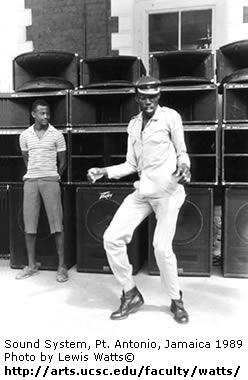
Above: Man skanking in front of sound system speakers
The mixing of the two cultures was popularized on a mainstream level by groups like The Clash and The Sex Pistols and was a quintessential moment in the changing sentiments in race relations in the UK.

The Clash

The Sex Pistols
That being said the brand is not about to pigeon hole itself into a Rasta/Punk brand by any means and in all actuality the two subcultures are only two small parts of a greater whole.
With the combination of those two polar opposite inspirations there are many ideas and aesthetics that Justin and I developed into the brand that we clearly see eye to eye on.
First and foremost being quality. Having been in the industry for a combined 12 years the biggest distinction that needs to be made amongst the hundreds of available brands is the quality of the product.
With the tees being the first offering we wanted to make sure that there was ZERO plastisol involved unless it was used on purpose for effect.
So with all the tees in the line you won't find any that have that a sand paper esq. feel that most brands settle for. Typically this is a monetary issue for most brands and if you can not find a good printer or simply don’t have the money your only option is regular plastisol.
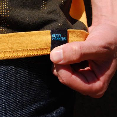
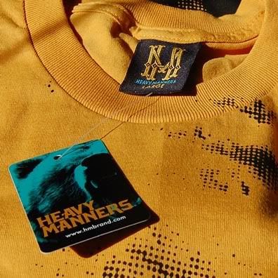
Our attention to quality will carry over into the cut and sew and fleece programs of the brand as well. All the tees include high quality woven and clip labels and varnished hang tags.
Seen here:
Again it is the little things that you instill into the brand that make it better.
Design:
The actual graphic design process started last October for the brand and changed constantly over the next 8 months until the list was cut down to what you see now. There are over 5 tee designs that did not make the final printing cut for various reasons, 5 different logo types that did not make it, and about 15 different brand logos that were mocked up that all lead to what we have now.
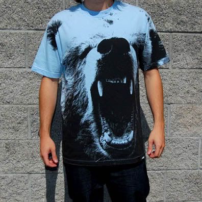
One of the first tees that Justin created is the one above called "Godless Killing Machines."
It is a simple half tone of grizzly bear. The title comes from a Stephen Colbert episode where he proceeded to call bears (all species there of) godless killing machines and names them as one of the Top 3 Threats to America. There isn't really any "profound" concept here, but the imagery is obviously very strong and fits with the overall tone of the line etc.
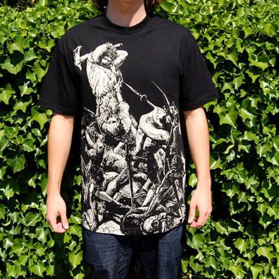
The story of "Big Ferre" is an actual account of a French soldier who was attacked at his home by 12 English soldiers and was said to have slain over five of them with just his axe and his back against the wall. After slewing the five soldiers the other seven bolted after which it is said the Ferre fell ill with an intense fever and later died.
Depending on the source the number of English soldiers vary amongst other details, but it said to be based on an actual event and person.
For a full account of the story click here
Justin came across this image and story. Both of us are adamant history buffs and usually rack up on Dover illustration books of various historical cultures at bookstores for a lot of design concepts.
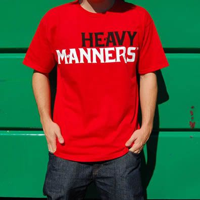
The "Logo Type" tee was our way of bringing more focus back to traditional logotype and simple branding style tee shirts, which has been lost in recent years from many brands. You'll find that most brands stay away from just simple and basic logotype tees for whatever reason. The logotype used to be a staple tee in every line and now people tend to lean towards more "gimmicky" styled tees where the name of the brand is done in a parody of another logo or done with some sort of pattern effect. To each there own, but simple branding never dies. Also what you can not see from the photo is the two words are done in different inks for an added texture effect, which was a concept that Justin explored quite a bit in most of the designs.
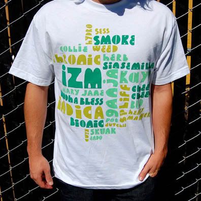
Kevin Lyons' "Healing of The Nations" tee is definitely a stand out design in my eyes for a lot of reasons. The first reason being that it was an opportunity to work with one of the best designers in the industry. Secondly, Kevin has been the design talent behind some of the better brands in the game such as SSUR, Stussy, Tokion Magazine, HUF, and Nike to name a few. He is a master of typography and should be credited as being the designer who brought the "hand drawn" and "grade school" looks to the biz.
The idea for this design came while I was writing the design brief for Kevin and I noticed that he had a lot of these play on word style font tees and it would be cool to take different slang names of marijuana and have him lay it out in his instantly recognizable style and this was the end result. This design also features hi-density inks on some the colors to give it a nice textured look and feel. Kevin is also a pretty big reggae nut himself so it was an easy sell to get him to lend his talents to the brand.
Check out Kevin's latest works and brand here at Natural Born
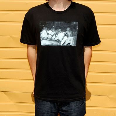
This tee is just simply called "Riot." It features the photographic work of one of my buddies Vernon Schmitt. Who is Vernon Schmitt? You probably don't know. He doesn't have a website, a book, a new line dropping, a show in the works, or anything that would give him any sort of mass appeal. He is simply a beer drinking, hockey playing, bad ass who happens to have been taking pictures for over 25 plus years.
He has seen much more through his lens then many of us combined and this image was one of the pictures that stood out for me when I was digging around in his basement through piles of photos ranging from George Clinton, Kurt Cobain, Bad Brains, Henry Rollins, human oddities, and the like.
The photo captures a bizarre albeit frightening moment during a riot in Detroit when the Pistons won the NBA championship during their "Bad Boy" era circa 1989/90. From what Vernon told me of the incident two skinheads had come around the corner during the riot and apparently instigated a fight between several blacks. They immediately began fighting and Vernon snapped a couple photos of the ruckus. Later the next day one of them was pronounced dead from injuries suffered in the fight.
I guess I felt that the idea of someone dying because of their ignorance on film was sort a vivid example of how idiotic racism really is. From a design stand point the shirt also is a tribute to the classic box photo tee. No need for some sort of clever tag line we just let the photo do the talking.
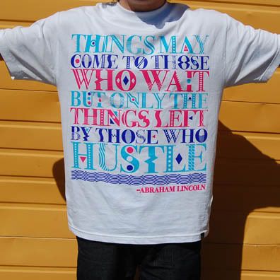
"Honest Abe" is actually the oldest design in the bunch and was originally going to be used for another line, but luckily found its way into our Fall line. After this tee came out I noticed that most people's first reaction was to ask whether Abe said this or not. I found this reaction funny seeing as I personally can't fathom why anyone would think that we would feel the need to put his name on the shirt if he didn't say it.
Justin came up with this design and worked on the type itself numerous times before settling on this version. There is a lot of "phrase" tees out there, but I have yet to see one this detail oriented. All of the type is custom and the tee again features the multi-texture concept with each color being a different type of ink water based, standard plastisol, and hi density.
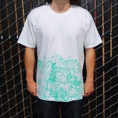
The "War In The Streets" tee again touches on our affinity for history and ancient empires. The graphic illustrates a Roman war scene drawn up in the style of the time. The best feature of the tee is actually on the other color way of this tee which features black metallic foil on a black tee. The problem we ran into with that color way is that it is almost impossible to photograph. Oh well.
Again this was just merely a way to give you an idea of what goes into the design process and the creation of a clothing label. I could write in length about certain ideas or concepts that are a part of the brand, but from my experience it is best to let the brand take on its on persona and to let people derive there own opinions.
To check out the other pieces or to purchase tees go to:
Heavy Manners


extremely hyped, already got the bear tee
ReplyDeleteThats what's up
ReplyDeleteGreat post! Thanks for the run down. It helps! Love the photos, too.
ReplyDeleteCongrats on your recent success :-)